Uncovering the Queen Celine cover
Deciding on the cover for a picture book is complicated. There’s a lot that goes into the decision. It needs to be a single image that represents the book, but one that doesn’t give too much away. It needs to seek attention on a bookstore shelf; to create a sense of curiosity in the shopper so they’re compelled to pick it up. It needs to be original, of course, but also something that people don’t feel confused about. It needs to speak to kids, as well as adults; both parents but also bookshop owners. If bookshop owners don’t like the look of it, they won’t stock it, right? It also needs to be something that the author/illustrator and the publisher is proud of, too.

With all the goals there’s a lot riding on the cover. How on earth do we decide on ‘the one’? Well, here’s how it worked for Queen Celine.
First, sketch for breadth
Before I start sketching, cover options are literally infinite. It could be anything. The layout, the colours, the characters that appear and the typography are all up for grabs. The only way to start refining this huge list is, well, to draw.
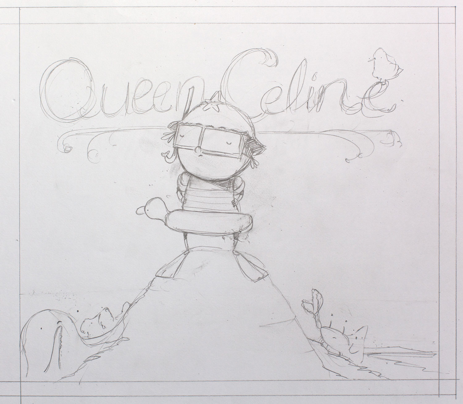
The aim at this stage is to go for quantity over quality – to start with ‘thumbnails’. Thumbnails are really tiny images with very little detail. There’s no colour, just pencil. Doing it this way prevents me from focussing on getting the drawing correct, and ensures that I try a whole bunch of options. For Queen Celine, as with any book I work on, I set myself a goal for doing at least 30 different thumbnails that aim to communicate different themes and aspects of the book. I try not to pass judgement on anything I draw (although that’s really hard). Here’s just a few:

Picking favourites
Once I work for breadth and start to see what’s coming out on the page, I walk away, maybe for a day or more. I need to clear my head, forget what I did, and come back to it in a few days.
After a day or two, I re-open the sketchbook and take a look at the thumbnails I’ve done. Sometimes, a few new ideas come to mind, and often I tend to have a few combinations of layout and characters that resonate with me. It might be a particular gesture that I captured, or a theme/character I particularly like. With Queen Celine, it was obvious we had to have her on the cover, but what of her subjects? How many should there be? What sort of emotions should they all have.
I whittled down my list to three very different approaches and explored them in a little more depth. I rendered them very roughly in pencil.


Sharing early Queen Celine covers with the publisher
These three ideas were then presented to the publisher. Finally! This is one of my favourite bits. I get to see whether the thoughts I’ve had whilst I’ve been all alone in my studio resonate with people.
Feedback is critical to getting the right cover. It’s important to put my own biases aside and ensure that the cover uses the incredible expertise and knowledge of the publishing team to make it the best cover it can possibly be.
Iterating on the covers
Sometimes the best thing that happens in the first round of feedback is that some cover ideas get immediately thrown in the bin. I love this. Eliminating options for very clear reasons means we know what isn’t working. And, knowing what isn’t working is a great way to know where to head next.
In the case of Queen Celine, the publisher saw promise in all three covers. Yikes! But, they did feel each one could be improved a bit before sharing it with the wider publishing team (i.e. Sales and Marketing). So, I drew new roughs for all three covers with their suggestions included.


The big moment: taking the cover to the broader team
Once I was confident that I had responded to the feedback and that I was happy with the next iteration, the covers were presented to the broader publishing team.
This is the big moment, the one where want people to ooh and aaahh over a cover. And, sure enough, we got that reaction. I’m sure you can guess which one; The Pedestal was the favourite!
It’s always a beautiful moment to know that, from all the infinite possibilities that this cover could have been, we’ve arrived at the one that fulfills ALL of the jobs that a picture book cover needs to fulfill. We’re filled with pride and now that we’ve decided, anticipation takes over as the final art begins.
Creating the final cover of Queen Celine
Painting the final cover takes a long time, especially because I work in watercolour. In my case, it took me over 5 hours. This includes drawing, the washes, and the final details that make it really sing on the page. Normally, I’d have three or four attempts at a cover to make sure I get it just perfect. But, perhaps it’s because I knew Queen Celine and her little world so well that, for this book, it’s just the one. It was, like Celine’s rockpool, rather perfect.
Purchase your copy of Queen Celine

As you can see, the cover design of a picture book is far from a simple process. It’s not easy work, in fact, it’s incredibly difficult, but it’s exciting. When you begin, you (and your publisher) literally have no idea where you’ll end up. Then, many months later, it arrives on your doorstep and then you take a moment, to sit with it quietly, knowing that you’ve all made the best book you could, together.